
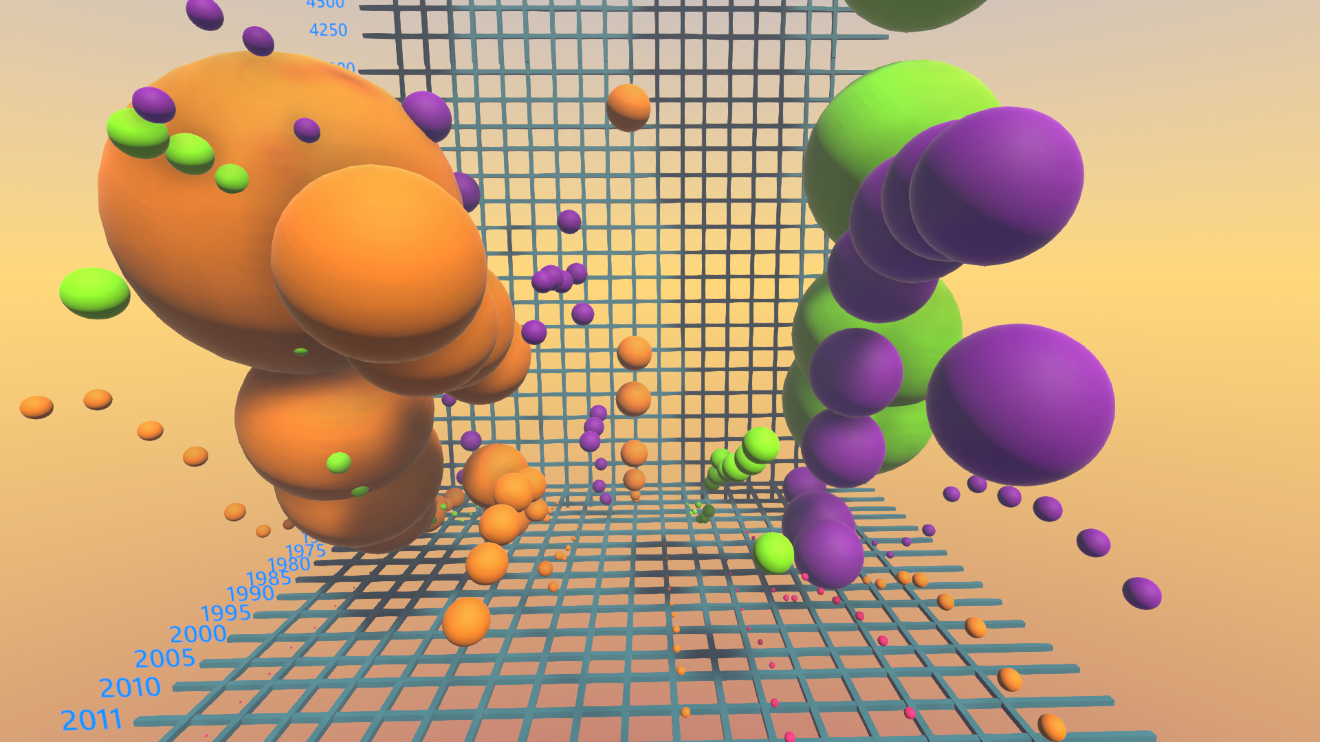
3D Data Visualization of CO2 emission per country per GDP per year. This graph demonstrate who we is contributing the most to climate change as well as who is actually reducing emissions. Selected only a few countries.
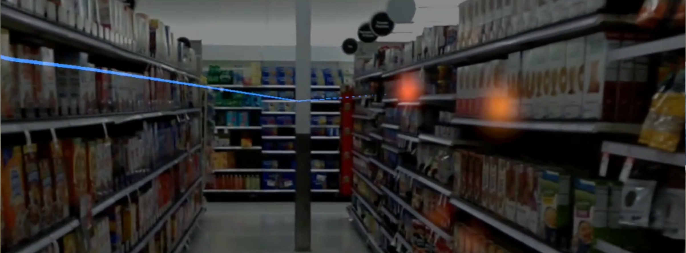
Once we got the Magic Leap, we started experimenting with its features right away. When David showed me the eye tracking example, I was very impressed by its accuracy while looking at real objects. We then got the idea to create a version of heat maps we have in data
Page 1 / 1