This was the first Data Visualization we built as part of our research in immersive data visualization for Augmented Reality. AR and VR brings a third dimension for database visualization. Our initial search for per-existing work or paper in the space was inconclusive. We found very few visualization taking advantage of the AR technologies. Most of the work we have found is using existing 3D graph visualization and bring into it an interactive component.
So we decided to start thinking on how we could use that third dimension and visual mobility to enable new insight and understanding of the data.
We created this visualization in Virtual Reality using Microsoft Maquette.
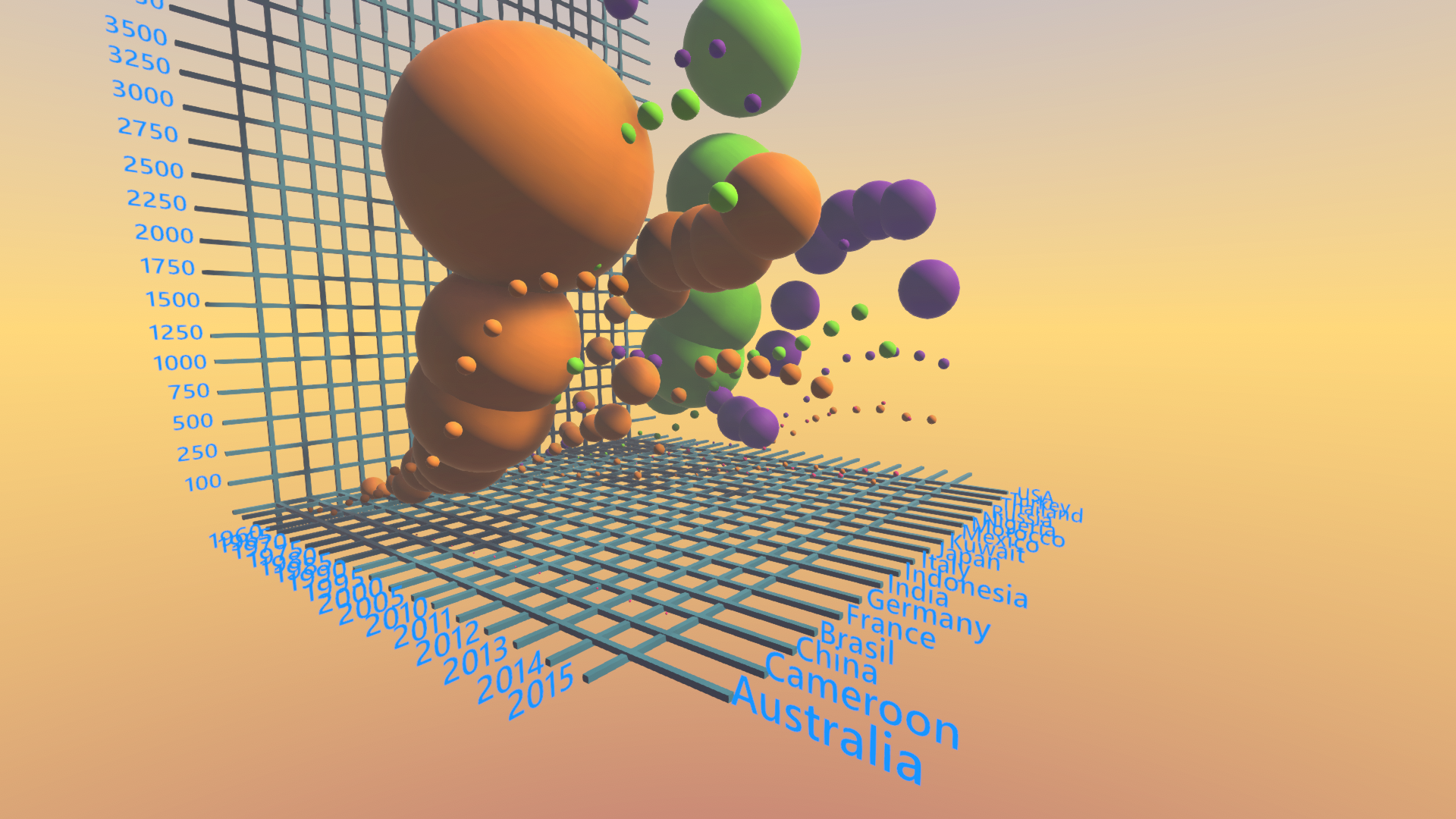
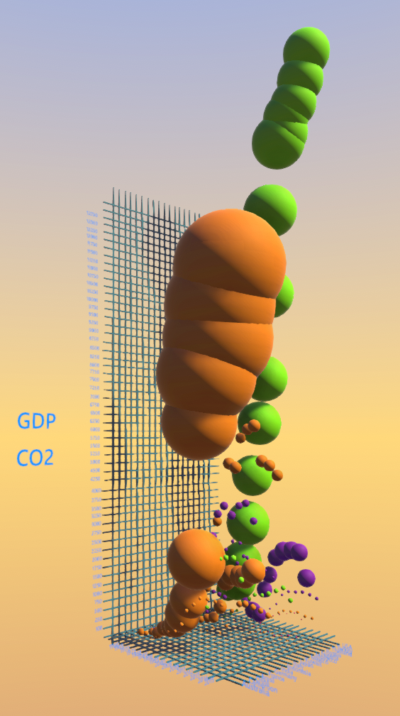
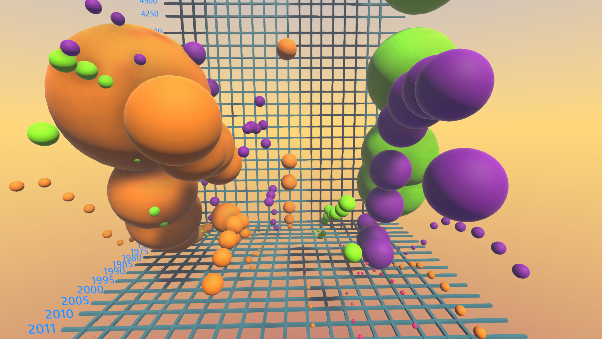
The first example we chose is a database from the World Bank DataBank on CO2 emissions per GDP. We selected a few countries and displayed their CO2 emissions over time, from 1965 to 2014. Starting from 2010, we displayed every year to reflect the large expansion.
The CO2 emission are represented as spheres and they are going up as the country GDP grows. The color of the spheres represent a continent: orange for Asia, blue for Europe, green for America, and purple for Africa.
Working on this visualization we got some interesting insights: The countries that worry the most about climate change inaction are actually reducing their carbon emissions. What stands out to me is how Asia totally over come in the past few years Europe and the USA as the largest emitters of CO2. Africa is currently very small and it match the continents low GDP with only minor growth compare to Asia.


