
As our lives are becoming more data-driven, we at AfterNow have been thinking about ways to visualize the information in more intuitive and engaging manners.
For this exercise, we took a dataset on sleep-related activities, comprising not only sleep cycles, but also key influencing factors such as exercise, caffeine intake, and late-night screen activity. Our goal was to come up with an exciting way to illustrate this information in 3D space.
We assumed that a 360° immersive graph that can be viewed by rotating or twirling, would bring valuable insight. However, our initial attempts did not work as expected and proved to be more confusing than anything else.
One of the problems we stumbled on was the issue of continuity as well as where the information should begin or end. Imagine standing at the center of a circular timeline. You could start by looking at the current date and rotate to your left to look back in time; so far so good. But what happens when you complete the rotation and come back to your original position? Does the graph still show the original start point, or should it continue the journey back in time? There was no intuitive answer to this.
Another issue with this format is that the data would get crammed very quickly. With the display of each additional day, the increase in fractions would result in decreasing amounts of available screen space. For example, 6 days would only leave a 60° arc per day: not nearly enough to convey the richness of the available information covering a 24 hour period.
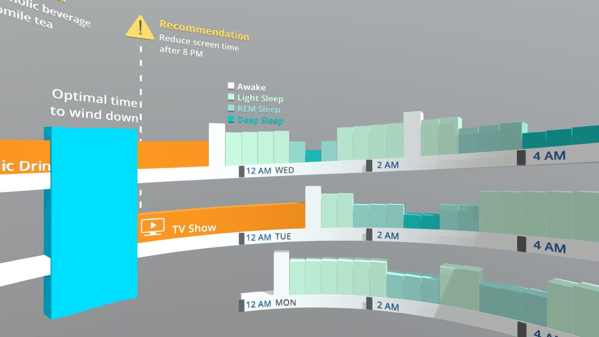
So taking these lessons into account, here is the concept we came up with instead:
We solved all of these issues by creating an immersive ellipse, covering one full day per 360°. This leaves not only an ample amount of space to display the information for each day, but as new data becomes available, the visualization can be refreshed by stacking the most recent information on top. We hereby assume the past is down, and the future is up. As you can see, the vertical stacking format has the added value of enabling quick comparisons between the same times for each day. So the user can quickly review day-to-day differences and identify causes and effects.
Our first prototype only displays three days as a proof of concept, but for our next iteration, a full week would be an excellent option to try. Another powerful tool for analysis could be an alternative view that vertically stacks only the same days of the week; for example, comparing the data from every Monday over the course of a month.