Our mixed reality experiences are continuing to evolve as we expand our practices in holographic UX. We can see the changes in our HoloLens Hue app, one of our earliest applications and "lights on" moments when we began exploring the Hololens' potential to work with the Internet of Things.
Anthony is building this for the team and has been improving on our original build from the summer, changing the colors on a single Philips Hue bulb with square block options that hovered motionlessly around the lamp, like so:
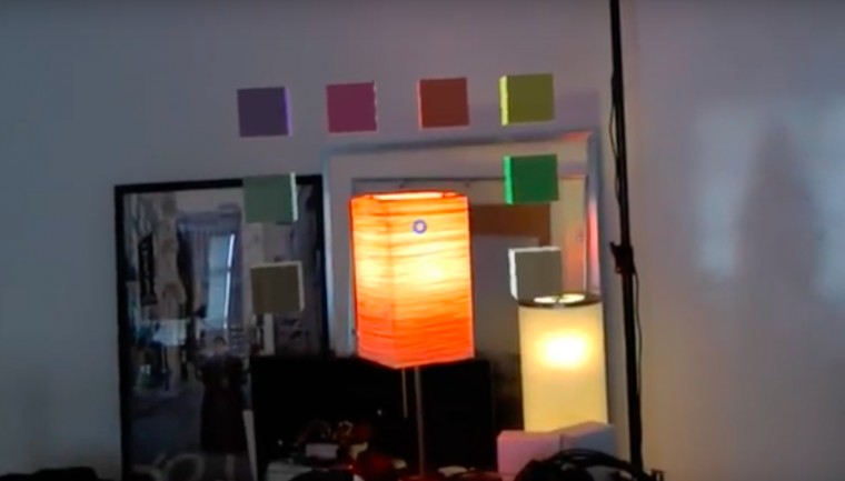
The first iteration of HoloLens Hue.
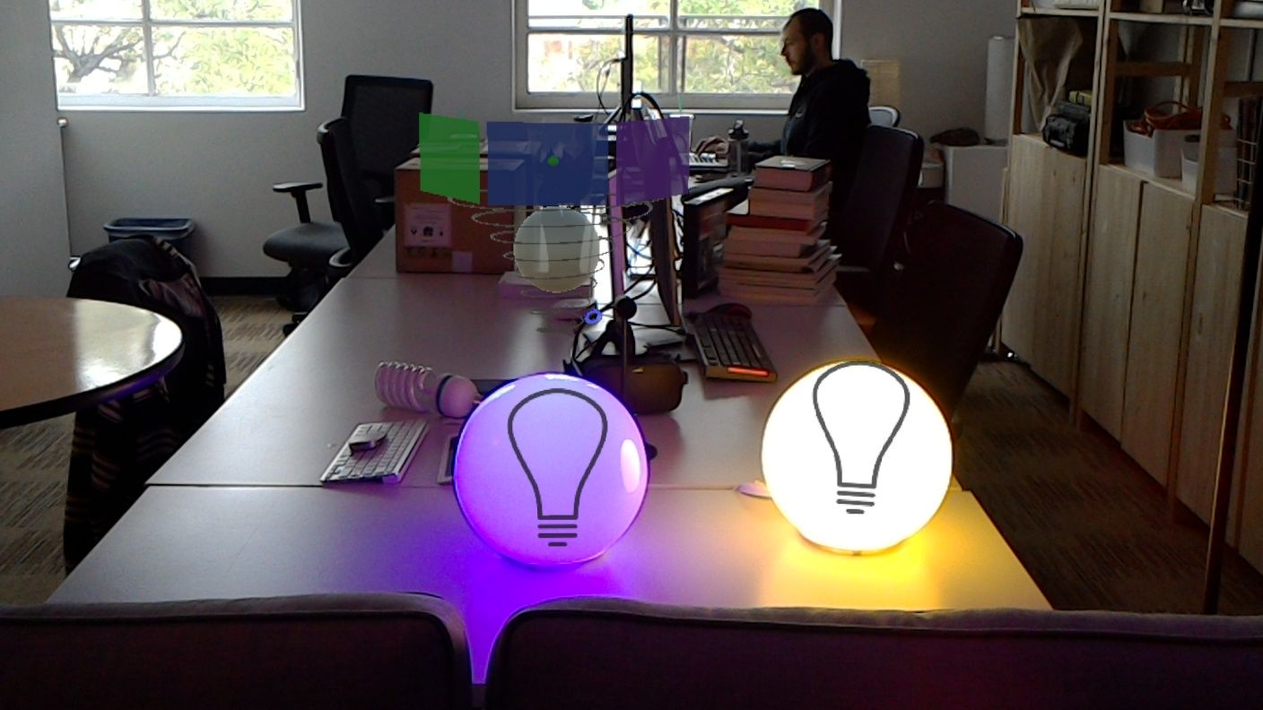
This UX makes sense for a flat screen, but to make better use of three-dimensional space and to also incorporate saturation control, our next iteration became a whirligig:
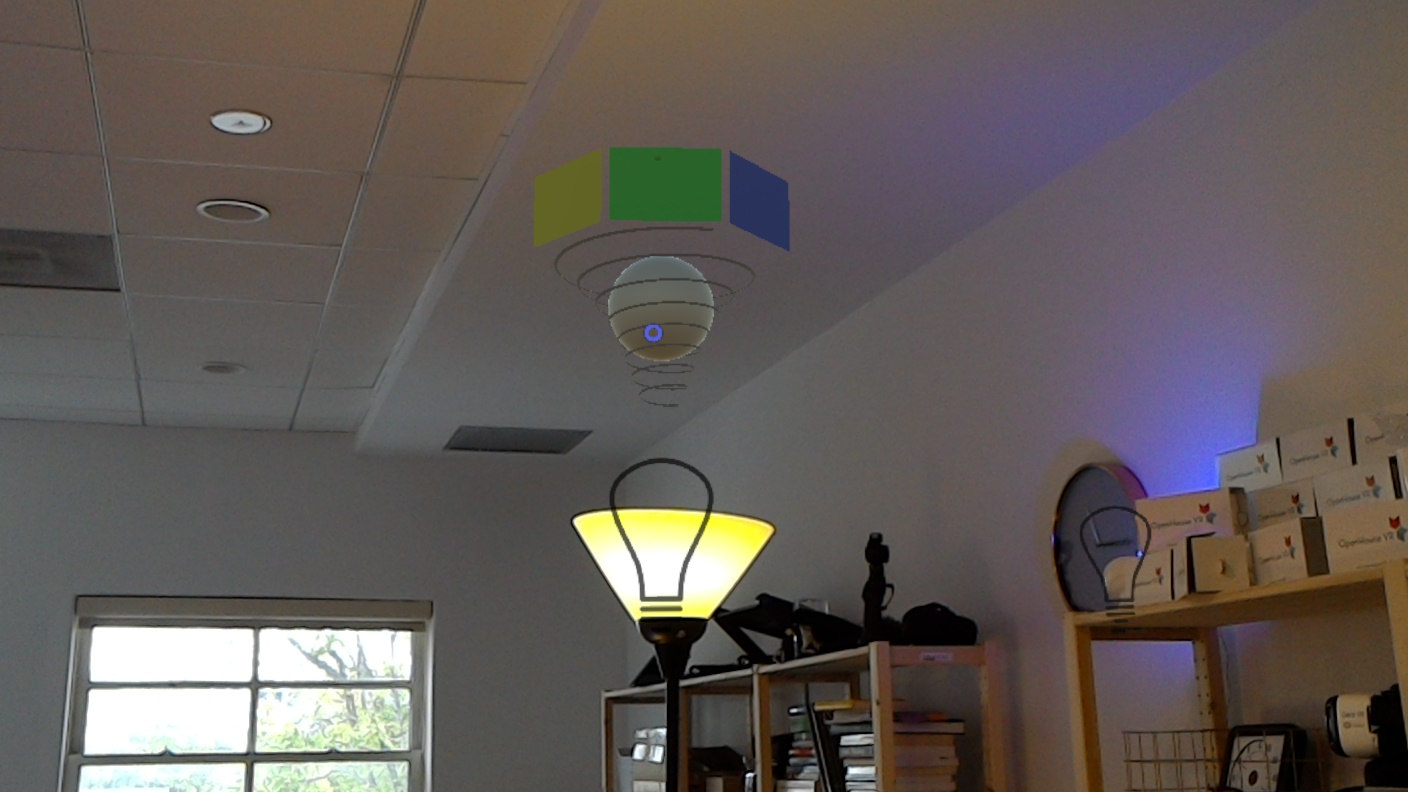
With this design, color, brightness, and saturation control can coexist within the same hologram. Tap-and-hold on the bubble and directing it up and down changes brightness, moving forward and back controls color saturation, and a tap-and-hold on the colors section moves your options left or right, depending on where you gesture.
Like so:
Moving forward with this app meant overcoming some major hurdles. Our original objective with this product was to tie a few of our tech demo ideas together to make a coherent app to release to the Hololens store. This meant a new challenge of creating a Hololens experience that would need nothing more than to be downloaded, installed, and run: no deploying source code from Unity, no access to debug logs -- and the greatest challenge of all, no one standing over your shoulder explaining how to use it. It just had to work out of the box, so creating clean, reusable code become a necessity.