
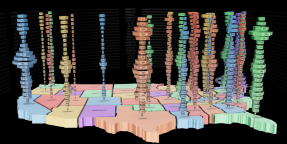
We created a series of new graphs with a new visual concept to grasp the gravity of the Covid 19 pandemic.
This first version is in the United States of America. We display a column of deaths composed of monthly rings for each state. The size of the ring is proportional to the number of deaths.
The original metaphor is smoke going up. Each monthly ring is a cloud going up containing all the death that month.
We have an animated version in a Prez presentation with an alternate view on Per 100k instead of totals.
Watch this data visualization in your Quest with Prez.
Presentation ID: 57318778
Install AfterNow Prez from this link:
https://www.oculus.com/experiences/quest/3434684843326642/
Then open AfterNow Prez in your Quest and enter as a Guest Access presentation id: 57318778 No need to create an account.
Create your own 3D datavisualization
We are working on a new application to create 3D datavisualization.
Find out more and join our early access list:
Immersive Data Visualization with Viz